Sizing text and blocks, although distinct challenges with their own particulars, in order for correctness to be retained and for things to stay as easy as possible to use, a mechanism is necessary for implementing a grid. That mechanism should be unobtrusive, rather than something that turns into a reference one needs to constantly look at. Therefore, the API surface should be very small.
A grid’s main function is to define the steps that any element can grow or be positioned into. In saying the word “grid”, it immediately comes to mind the idea of columns, but a column is really just a helper for understanding the fact that you are in reality putting things in a map of coordinates.
Think of a chessboard. The grid is composed by squares, and you can only move one square, or many, or half (half being unlike chess, generally not recommended, but technically within proportion), but never by 77% of a unit, or another non-proportional measure. This is, I’ll admit, an oversimplification, but that’s the general idea.
Creativity wants freedom. And these constraints can come across as being opposed to that, but in fact they’re there to assist you with keeping order, a key element of aesthetics, and thus, good design. In short: using a grid helps making things look right on the screen.
Let’s start by addressing the problem of measurement units, and a common misconception about them.
Much has been said about px, ems, rems. In short, px being considered wrong, ems are ok, and rems are “easy ems”. I’ll propose something else entirely: when you work with scales, the unit does not matter, not even a little bit.
The px stigma, to the best of my knowledge, comes from the old days of the web when Internet Explorer had a bug in which text wouldn’t scale up when the page was zoomed (Ctrl/⌘ plus). Someone then coined that pixels were a bad idea, and from thereon, discussing pixels became a lot like discussing communism.
The proposed solution to the problem was to use ems instead, but with ems comes great power, and with great power comes great responsibility. ems are a proportional, tool-like measure which can very easily create a cascading mess of font sizes if not used mindfully.
For example, it’s not rare finding font-size directives applied to containers. Small containers that have one font size used by all its child nodes would be fine, but consider this:
In setting the section’s font size to something like 1.6em, every child node gets its base size reset to that value. Meaning: if the font-size of h1 is set to 1em, nothing changes, because 1em means 100% of the parent’s font-size, for all intents and purposes.
But we want the heading size to be slightly bigger than the rest. So we go:
h1 {
  font-size: 1.3em;
}
And perhaps blockquotes should be a bit bigger too:
blockquote {
  font-size: 1.1em;
}
And the aside should be smaller, right? That makes sense:
aside {
  font-size: .8em;
}
In short, you’re actually saying 130%, 110%, and 80% of the container’s font size. For clarity sake, you may as well just use percentages, since what you mean is then expressed directly.
Now picture what happens in a web app scenario with multiple nested components where root node has a font-size reset to something else other than what you expected. Granted, this is an example of ems in misuse, so this doesn’t mean ems are a bad idea. But they carry tooling with them, which don’t fit the vision that you're learning in this booklet. We operate through a scale, and the scale is the source of all correct sizes. Hence, font sizes that come from a consequence rather than it are, in this instance, wrong.
Last, it’s worth mentioning viewport relative units, which are also tooling units that can come in handy. These units are, as the name implies, for sizing things according to the size of the screen.
For example, setting an element’s width/height to a percentage achieves one thing: it sets it to the width of the parent. Browsers won’t figure that when you say height: 50% you probably mean 50% of the height of the parent.
.wrapper {
  width: 500px;

  .container {
    height: 50%; // Height will be 250px, because the
                 // width of the parent is 500px.
  }
}
In saying “the parent”, you may be going for the viewport (a.k.a. the browser window) width. That’s where viewport relative units come into action. You can use 50vw for 50% of the viewport width, and that will yield a reliable 50% of the window width. For height, you can use height: 50vh to get 50% of the window height, and this is particularly useful for modals, or overlays that are sized in relation to the window size.
I won’t go into length here about that since there are specific tutorials on viewport relative units out there that also explain vmin and vmax units. This is just so you’re aware of them.
Grid frameworks are, in a way, a crutch. Some are fine tools, but as a developer, the more you understand the problem domain, the more powerful you become, and this is a problem that only feels hard if you never bothered doing that. This belief ultimately leads to you being constrained by nothing but your creativity, and never by your technical expertise. You're welcome to outsource this to a tool once you learn it. But I'm sure you won't want to.
Every time someone suggests a field needs to be enlarged by one pixel, unless they’re out to fix what’s already a broken sizing system, it’s almost a given they’re not using any metric properly, and that won’t get you far. It also makes the discussion a lot more complicated: suddenly it’s up for debate things that are, in reality, either in the correct place or not at all.
A grid has units, and things should fit nicely inside these units, including text. When upsizing a font, you upsize it with a scale, which also simplifies your options: you can move the font size up or down the scale, and the scale, which we will implement with a Sass function, will output a pixel value. In short, there’ll be font sizes 0, 1, 2, 3, or X until it’s too large (or negative numbers too), but you won’t ever again pick a font size that just appears right through trial and error.
Similarly, block elements that have fixed, or maximum/minimum, dimensions will have those set by a units() function. So instead of setting a fixed number of, say, pixels to a container, it’ll be like this:
.a-container {
  width: units(6);
}
A text node’s height is not determined by the font-size directive alone. That will be taken into consideration, but it’s actually the line-height that will. Sure, you can set the height with a directive, and then that will be it. But this will make for a tall text node that looks weird. CSS is flexible like that and it’ll let you do stupid things. That in fact is another common source of grief. It’s up to you to put that flexibility to good use.
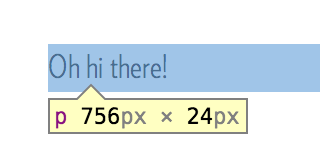
See this:
p {
  font-size: 16px;
  line-height: 1.5;
  margin-top: 16px;
}
Which creates a paragraph like this:
You can see the node is 24 pixels tall. If this paragraph were two lines long, it’d be 48 pixels tall. That’s because by setting line-height: 1.5 you declared that the line height should be 150% of the font-size value.
There’s nothing technically incorrect in styling things like this if all you care about is the outcome, and if the grid unit size is in fact 24px. But what comes with setting things like line-height using per-selector proportional measures such as the unitless number above is you’re not being systematic. You’re creating a per-selector agreement of metric which can be hard to track when it happens all over the place. And soon enough the design is full of holes.
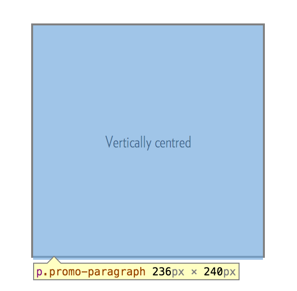
Text is always positioned in the centre of the line. So if you want to vertically align a text node, simply give its line height the same height of the container:
That wasn’t so hard, was it? As a matter of fact, next to nothing is truly hard to do with styles once you grasp how the basics work.
Now armed with this knowledge, we can establish a few ground rules:
The base line-height value is 1 unit, whatever we decide the unit size should be.
Text can obviously be bigger than 1 unit, but in that case it’ll take more than one line (or unit) to accomodate it.
The dimensions of containers that have fixed dimensions will always be X units for either.
Padding and margin values will also be specified in units.
To be clear, this doesn’t mean you’ll need to go around setting the height of everything. If a section has text inside and it needs to grow as tall as necessary to accomodate it all, that’ll happen naturally and correctly as you add text that’s correctly sized by the proper font sizing mixins below.
What I’m describing here is the same approach implemented by Gridlover. Gridlover is an excellent tool for generating a scale which you can copy and paste into your styles. If you’re not familiar, go play with it and fiddle with the values a little. This will help clarifying the concepts explained thus far, and visualising how text fits inside lines.
Having a single combination of font size, unit, and scale, won’t be enough to accommodate all of your sizing needs since what suits the average laptop display size will not suit a mobile phone, or a large 27" monitor. Therefore you’ll usually keep around one combination for each. This is not the end all of sizing, but enough for most needs.
When we address responsiveness later on in this booklet, we will go through the use of the first and last scales. For now, know that the functions and mixins coming up next will default to using medium.
The above is a Sass map. Think of it as a hash where we store the aforementioned scales. This then becomes the only place where you need to change any metric, going forward.
Now comes the actual calculations and functions. I’m using a pow() function taken from Sassmeister, which I found via an article by James Steinbach, on this same topic of vertical rhythm, so I won’t repeat it here.
The first function we’ll look at is one that’ll use the scale above to output values we can use in directives:
The parameter should always be an integer, and it can be smaller, equal, or greater than zero. Technically it’s possible to use a fraction, and it’s not incorrect so long as the font remains within the bounds of the line height, but you should try and pick scale value that allows for as much granularity as you need for the design. Again, Gridlover provides a wealth of choice and a visual way of testing those.
An example on setting the font size with the function above:
Next comes a function for outputting a unit that conforms with the grid, which we’ll use for paddings, margins, widths and (line) heights when set to a fixed value.
In keeping with the lingo, and to avoid overly high numbers being passed to units() which end up not meaning much to a human, column() outputs a column width. The convention this sets is that a column width is 4 units. You could potentially keep this factor in a variable outside of this method.
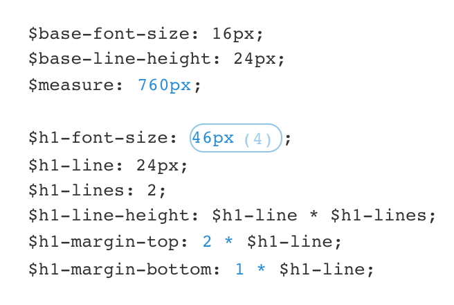
And finally, a mixin for making it easy to set font sizes that come with a correct line height value. This maps directly to the result you get from dragging the scale value in Gridlover, as below:
To briefly explain what happened in the previous function declaration, in order:
After some digging, we fetch the base unit from the scale specified in the second argument (if no argument is passed, it'll default to medium) and put it into a $lh variable. This variable will contain the minimum valid height for a line-height, which is always 1 unit.
In a @while loop, we increment $lh by one unit until it can accommodate the height of font-scale().
We then output a font-size and a line-height directives with the generated values.
Throughout this booklet we’ll be using the above mixin for sizing text all over.
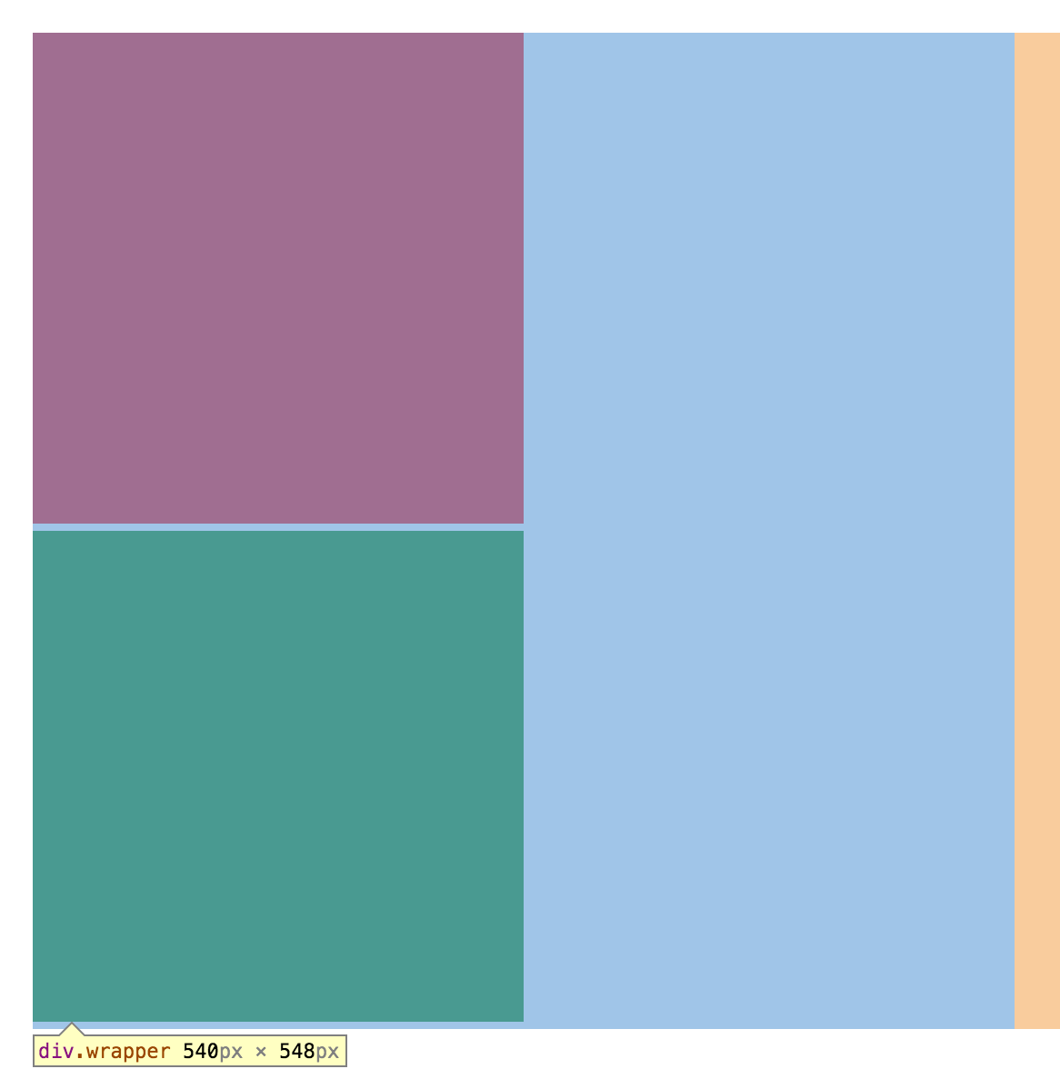
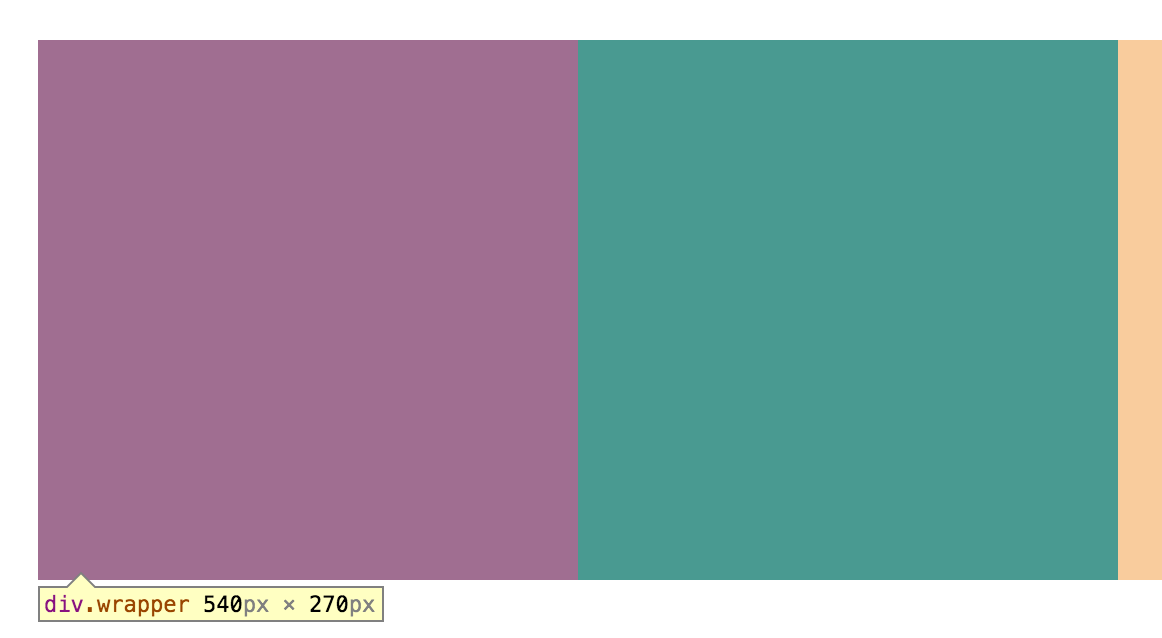
This short puzzle will help clarify how sizing things in a browser works. Say you want a container of a fixed width to perfectly contain two other containers inside, where .container-a is the blinding red block and .container-b is blinding green one.
The first thing most think to do float each to one side, and clearfix the root container, which despite working, is a gross hack. In reality, you don’t want to float anything as you would with, say, an image that’s inside a paragraph which is meant to be on the right side of the text. The two sub-containers are inline block elements. Meaning: they are block elements that don’t take the entire horizontal space unless you set their width to that.
The “problem” is the existence of something known as a text node. A text node is how the browser understands just the text that’s within a tag. And guess what: what’s separating the two inner tags above, in the writing of the HTML, the carriage return or “enter” you pressed, is one of those. And it takes space too.
Since as you can see text nodes take space too, so actually, you’re asking for .wrapper to contain the two sub containers (each with a width of 50%) plus one text node, which is just enough to derail the whole thing.
But surely we don’t want to write shitty markup for the sake of things working as you’d expect in the first place. Since the role of the root wrapper is really to just contain the sub-containers and no text, the correct way to solve this is setting the size of text for the root wrapper to zero. It can then be restored in the sub-containers themselves, or in any text tags there may be in them.
It needs to be painfully clear that the reason why we’re doing this is so we work with the browser, and not against it through hacks. There’s a number them for solving the problem above, and while I won’t cast the first stone, we should strive for solutions that tackle the real issue as much as possible.
One last technique worth mentioning is calc(). Calc is a CSS function which, to make a long story short, it lets you mix different measurement units.
It’s especially helpful when you mix fluid containers with containers that have fixed dimensions. Click (or touch) and hold over the container below to see it in action.